The Conversion Rate Logic of Minimalism in Shopify Store Design
A Shopify minimalist theme is more than aesthetics. Learn how cutting cognitive overload and applying Hick's Law can optimize your design to drive higher sales.
In the e-commerce world, new Shopify merchants often fall into a common trap when designing their storefronts: the urge to squeeze everything into the homepage. They stack rotating banners, aggressive countdown timers, neon trust badges, and relentless pop-ups, thinking more features equal more sales.
But from a professional UI/UX and Conversion Rate Optimization (CRO) standpoint, this "maximalist" clutter usually backfires.
Today, we’re setting aesthetics aside to look at the cold, hard science of cognitive psychology and conversion data. Let's break down why minimalism—the defining design language of top D2C heavyweights like Apple, Zara, and Cuyana—is actually the ultimate revenue driver for your Shopify store.
1. The Psychological Blueprint: Why Less Equals More Revenue
Minimalism in web design isn’t about being "empty" or "unfinished." It’s about strategic restraint. The high conversion rates of minimalist stores are anchored in three fundamental principles of human behavior:
Hick’s Law & Reducing Cognitive Overload
Hick’s Law states that the time it takes for a person to make a decision increases with the number and complexity of choices available.
When a visitor lands on a Shopify site cluttered with five competing promotions, multiple primary Call-to-Actions (CTAs), and a chaotic sidebar menu, they experience choice paralysis.
Minimalism strips away the secondary noise, slashing the user's cognitive load. By clearing a direct path from "landing" to "product discovery" to "checkout," you remove friction and accelerate the buying decision.
Master Visual Hierarchy with Whitespace
In a minimalist interface, whitespace (negative space) isn't wasted real estate—it is your most powerful visual guide.
When a clean, uncluttered page features only a single punchy headline, a high-res product shot, and a solid-colored button, the user’s eyes have nowhere else to hide. By pulling elements apart and letting them breathe, you gain 100% control over the user’s visual journey, ensuring they focus instantly on your hero product.
The Organic Speed Boost
Page speed is the ultimate conversion killer. The visual restraint of minimalism inherently translates to cleaner CSS, fewer asset requests, and a massive reduction in clunky, script-heavy third-party apps. This "code-level weight loss" gives your Shopify store lightning-fast load times—which is the single most direct way to boost your conversion rate.
2. A Designer’s Blueprint to Modular Minimalism on Shopify
Transitioning from theory to practice requires intentional reduction. Here is how to apply minimalist principles across your Shopify sections and blocks:
The "Rule of Three" for Typography and Color
Minimalist UI demands intense discipline within your design system:
- Color Control (The 60-30-10 Rule): Dedicate 60% of your store to a neutral dominant background (crisp white, off-white, or muted grey), 30% to a structure color (text and core branding elements), and only 10% to an accent color reserved strictly for your primary CTA (Add to Cart). When your buy button is the only bright splash on an entirely neutral page, its click-through rate skyrockets.
- Typographic Restraint: Limit your store to a maximum of two font families—one for headings, one for body copy. Avoid over-styled, trendy display fonts. Stick to clean, highly legible sans-serifs (like Inter, Helvetica, or Roboto), and use contrasting font weights and sizes rather than multiple colors to establish what matters first.
Clean up the Product Detail Page (PDP) "Above the Fold"
The product page is where the sale is won or lost. A minimalist, high-converting first screen should follow a strict hierarchy:
- Eliminate Distractions: Kill the "fake" live-purchase pop-ups and redundant social sharing icons that pull attention away from the checkout funnel.
- Consolidate Core Info: Set up a clean split-layout. Keep the left side dedicated to high-fidelity imagery with smooth hover-zoom effects. On the right, display only the essentials: brand/product title, clear pricing, crisp variant selectors, and a high-contrast "Add to Cart" button.
- Give Information Room to Breathe: Tuck complex size guides, material specifications, and shipping policies into clean, collapsible accordions. Let users dive into details on demand without diluting the initial focus on the buy button.
Streamline Navigation to the Essentials
- Trim the Header Menu: Your main navigation should not look like a site directory. Keep it limited to 3 to 5 core pillars (e.g., Shop All, New In, Best Sellers, Our Story). Move legal policies, FAQs, and contact links entirely into the footer.
- Leverage Mobile Micro-Interactions: On mobile screens, hide everything non-essential behind a sleek hamburger menu, keeping 100% of the immediate screen real estate focused on high-impact product imagery.
Replace "Billboard" Marketing with Elegant UI Alternatives
Many Shopify themes get ruined by heavy-handed marketing apps. You can drive urgency without sacrificing the premium feel:
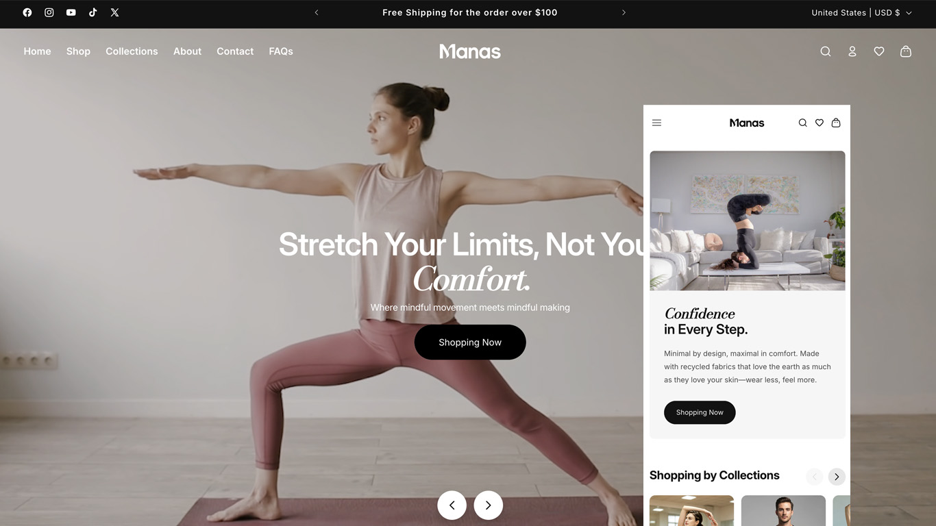
- Instead of disruptive email pop-ups, use a sleek, sticky Announcement Bar at the top of the viewport to communicate free shipping thresholds or promotions.
- Use a smooth Slide-out Cart (Drawer Cart) rather than redirecting users to a dedicated cart page. This allows shoppers to review their order and head straight to checkout without losing their place on your store.
3. The Pitfall to Avoid: Minimalism Is Not "Emptiness"
A quick word of warning for designers and merchants: the opposite of minimalism isn't maximalism—it's looking boring and cheap.
When you strip away decorations, borders, shadows, and parallax effects, the elements that remain on the screen are magnified tenfold. Because of this, minimalism demands perfection in two areas:
- Editorial-Grade Visuals: Without busy graphics to hide behind, your product photography, lookbooks, and video loops must be flawless, color-coordinated, and expertly framed.
- Laser-Focused Copywriting: Fewer words on the screen mean every single syllable carries massive weight. Your Value Proposition must be punchy, crystal clear, and instantly address the customer's core desire.
The Bottom Line
In the Shopify ecosystem, "Less is more" is never just a design trend—it is a conversion engine. By exercising visual restraint, you hand the user's most valuable resource (their attention) back to the product itself.
The next time you audit your Shopify store, try turning off a couple of intrusive apps, widening the padding between your sections, and giving your interface room to breathe. Your customers—and your revenue analytics—will thank you for it.